
Redefining Content Ordering Journey for Better User Engagement
TIMELINE
4 Weeks
TEAM
4 Designers, PM
INDUSTRY
B2B
MY ROLE
Admin Flow (Client) independently
UX Research, UX audit, Ideation, Screen flows, Wireframing, Prototyping, Visual Design
Introduction
Text Mercato Solutions offers on-demand professional content creation services at scale, catering to various needs such as text, translation, and graphics. Notable clients like Khatabook, Unacademy, MakeMyTrip, among others. In this project, we've revamped the user experience, redesigned the UI, and enhanced user engagement and retention.
Overview & Context
This UX case study is on improving the content order process for clients in a content writing business. The project aims to address challenges faced by clients in ordering and tracking content solutions, streamline the complexities and apply user-centered principles to provide an efficient and heightened user engagement
Target Audience
Businesses, agencies, and professionals seeking efficient content creation solutions through content ordering platforms.
Challenges
Friction-laden Interaction
Clients currently rely on managers rather than using the platform directly, leading to dissatisfaction and inefficiencies.
Ambiguity in User Pathways
The interface lacks the definition of primary and secondary actions, causing confusion and hampering desired user interactions.
Cognitive Overload
Overwhelming interface elements confuse and hinder efficient navigation.
Usability Shortcomings
The platform lacks findability, usability, and requisite assistance.

DEFINING PROBLEM
The existing content order platform lacks usability and transparency, unclear pathways, and cognitive overload, leading clients to bypass it in favor of managers. This results in communication challenges, confusion, and a suboptimal user experience.
Goals
BUSSINESS GOALS
Operational Efficiency Enhancement
To reduce the need for manual intervention and minimize miscommunications (through managers)
Improved Client Relationship
To accommodate diverse user needs and interactions as the business expands.
USER GOALS
Seamless Content Ordering
Facilitate a frictionless and intuitive content order process, expediting client interaction.
Action Clarity
Define unambiguous primary and secondary actions in the interface, nudging the user to navigate and increase engagement.
Elevated Usability
Enhance the platform's usability and user discoverability, minimizing cognitive load and promoting a smooth experience.
Enhanced Transparency
Augment client satisfaction by offering real-time order tracking capabilities, ensuring transparency, and reducing dependence on intermediaries.
Impact
For confidentiality reasons, I have omitted the actual values for these metrics.
BUSSINESS IMPACT
80%
Reduced Dependence on Managers of the active users (Avg. time spent has been increased)
Easy Content Ordering, Real Time Tracking

30%
Increase in adoption rate
Transparency & Customziation of Order

Boost in user retention, addressed core navigational issues

DESIGN IMPACT
-
Navigational Overhaul - Elevating User Retention through UX Redesign"
-
Unified Design System - Design Consistency for Seamless Experiences"
-
Efficient Design Handoffs - Centralized structuring and organizing of Figma file for easy handoff.
Design Process
DISCOVER
Secondary Research
UX Audit
DEFINE
Problem Statement
Defining Scope
Affinity Mapping
IDEATE
Concept Sketches
Visual Design
Wireframing
IMPLEMENT
Prototype Testing
Key Solutions
Learning
DISCOVER
Secondary data collection
Secondary data sourced from the product manager includes insights obtained from usability testing results. Insights are from the product managers' assessments, evaluations, and observations during usability tests. This includes details about how users behave, what they prefer, and the problems they face while using the product.
I find it quite confusing to order content . It's not straightforward, and I'm not sure where to start.
When I use TextMercato platform, I'm not always sure what buttons to click or where to go next. It's not very clear
No Action Clarity
Ordering Takes Longer "Ordering content should be quick, but on TextMercato, it takes longer than I'd like. It's not as seamless as I expected.
Friction
I wish I could track my orders in real-time. Right now, I have to rely on TM team for updates, which is not convenient.
No Transperancy
There's so much going on when I open the platform. It's overwhelming, and I'm not sure how to navigate everything
I have to remember all the steps and actions I need to take here. It's not as smooth as I hoped it would be
Information Overload
I get confused while using this platform.
I have to spend a lot of time trying to figure out how things work
Cognitive Load
Sometimes I struggle to find the information I need on the platform. It's not very friendly when it comes to discoverability."
Discoverability
UX Audit
UX analysis to pinpoint areas where the user experience falls short. This aimed to ensure that the solution aligns well with the audience's needs, thereby boosting user engagement and retention. This, in turn, enhances the overall success potential of the product. UX Audit parameters are mentioned below

UX AUDIT PARAMETERS
Heuristics
Visual Design
Navigation
Hindering users from properly completing actions like marking articles as completed or rejected.
Dashboard

1
2
3
4
5
6
7
8
9
Too many confusing status, visibility of unnecessary status ex. vetting
Lack of clarity regarding the criteria used to display status updates within articles containing multiple tasks, leading to confusion about task statuses.
Absence of data indicating the number of tasks within articles, causing a lack of visibility regarding task quantities.
Clients often struggle to find essential actions like placing an order
Empty navigation bar, causing confusion or difficulty for users in accessing their profile or personal information.
lack of clear notification & systems for users to receive important or critical information.
Clunky scanning UX
uncertainty about the consequence if a user approves an article while its tasks have statuses like "Rejected," "To Review," or "In Production."
Task Screen
1
2
3
4
5
6
7
lack of guidance for users on where to locate a pasted link that's crucial as per the requirements
Lack of functionality, users are unaware of the active state of the "View Status", which will leads to a new page
Lack clarity to confirm if the user is on the tasks screen.
On Hold" status for task statuses, might create redundancy within the article status framework consisting of "Completed," "To Review," "In Production," and "Vetting."
lack of a clear method to communicate, for client order rejections.
Messy Alignment and missing Visual Hierarchy
Order Brief Screen

1
2
3
4
Uncertainty in the user's mental model, which might lead them to click on various tabs without knowing their distinct functionalities or differences.
lack of forewarning for users about potential data loss when switching between detailed brief and quick brief modes.
Absence of a navigation bar, indicating design inconsistency
back button at the bottom, causing confusion & inconvenience for users accustomed to its typical placement.
Order Summary Screen

1
2
lack of relevance, why a user might want to view a second screen after clicking the checkout button
Absence of navigational elements like a back button, navigation bar
DEFINE
Key Points
WHAT WE DID
Walked through entire client side, content ordering platform looking for key issues when ordering content
FINDINGS
We've recognized various UX and UI issues and organized them into categories. This classification helps in devising simpler solutions, aiming to minimize the absence of crucial elements that cause inconvenience.
AFFINITY MAPPING
Organise, categorise, prioritise, revisited to track progress for driving solutions for the findings

Opportunity
Seamless Content Ordering
-
Clients' Navigation Struggles
-
Article-Tasks ambiguity
-
Screen Recognition Challenges
-
Missing Navigation Bar's
Action Clarity
-
Complex Statuses
-
Missing Button Affordance
-
Missing Article-Tasks Interaction
Enhanced Transparency
-
Absence of Real-Time Tracking
-
Clarity on the Checkout Screen
-
Important Information Visibility
Elevated Usability
-
Scanning and Navigation Issues
-
Data Loss Prevention
-
Inconsistency in Design
IDEATE
Site Map
We have created a task flow for the client content order. On top is the current user flow. On the bottom, we have the newly improved user flow.
BEFORE

AFTER

Sketches
Sketches offer an early glimpse into my initial concepts, allowing for rapid visualization of ideas. My primary focus at this stage is divergence, exploring various possibilities before converging. Below are some early sketches depicting the client content order flow

Visual Design
Rubick's design system streamlines work by addressing inconsistent components and user experience issues. It comprises numerous components featuring well-defined typography styles, icons, and illustrations. These modular components provide a cohesive, reliable user interface.
The design system remains iterative and continuously evolves. Among the numerous components developed, here are a few showcased examples.
Foundation
Colors
Typography
Spacing
Icons
Grid
Components
Component 1
Component 2
Component 3
Component 4

Wireframing & Prototyping

FINAL DESIGN
PROTOTYPE
PRODUCT SCREENS
Note: There are over many screens for each archetype, logo, and other details, with some information modified to comply with the non-disclosure agreement.
IMPLEMENT
Key Solutions
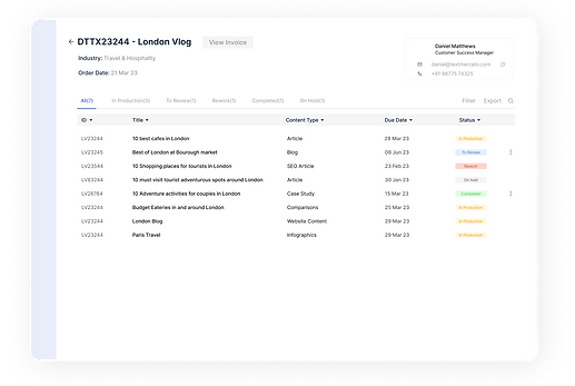
Dashboard


BEFORE
AFTER
Each article now displays task statuses using colors (red - on hold, blue - in progress, green - completed) alongside the number of tasks in the same status, which increases task visibility for incomplete items and reduces accidental completion of articles.
Primary action of placing an order is prominently placed, enhancing its affordance
Brand design system has been integrated to fix design inconsistency, alignment and visual hierarchy.
Mandating rejection reasons enhances clarity in communication when rejecting orders.
Task Screen

BEFORE
AFTER

Ensure status consistency across articles & task to avoid redundancy & irrelevance.
Improve clarity by using precise naming conventions for screens.
Enhance functionality by implementing clear visual cues for the active state of "View Status", ensuring users know it leads to a new page.
Implement clear guidance or instructions for users to easily locate crucial pasted links as per the requirements.
Allow users to view real-time status updates for articles, including each task's status and its corresponding deadline.
Improved system scanning experience for users by streamlining the interface.

BEFORE
AFTER
Order Brief Screen
Enhanced tab functionalities minimize confusion by providing clear visual indicators of the tab's status.
Implemented warnings to alert users beforehand about potential data loss when switching between detailed brief and quick brief modes.

BEFORE
AFTER
Order Summary Screen
Optimized the checkout process to make the necessity of displaying a reduced second screen
Implemented clear notification systems for users, specifically when payments are successfully processed.
Takeaways
-
Managing Messy Revamps: Breaking down extensive platform improvements into smaller, manageable tasks helps avoid feeling overwhelmed by the scale of the project.
-
Predefined Criteria for Design: Setting clear criteria beforehand minimizes excessive back-and-forth in design changes, streamlining the design process for more effective outcomes.